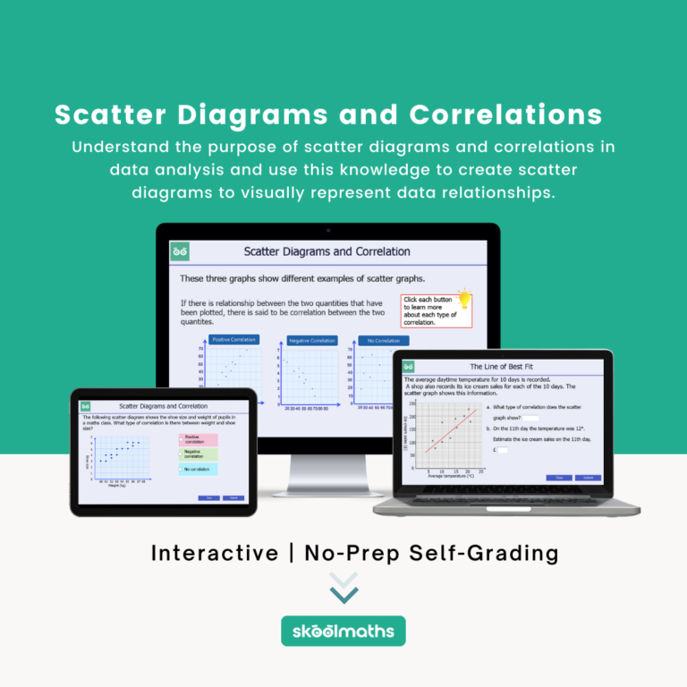
By the end of this unit, students will be able to:
- understand the purpose of scatter diagrams and correlations in data analysis;
- create scatter diagrams to visually represent data relationships;
- calculate and interpret correlation coefficients to determine the strength and direction of relationships.
Curriculum Alignment: Key Stage 4: Statistics
- use and interpret scatter graphs of bivariate data; recognise correlation and know that it does not indicate causation; draw estimated lines of best fit; make predictions; interpolate and extrapolate apparent trends whilst knowing the dangers of so doing.