One-time purchase. Instant digital download.
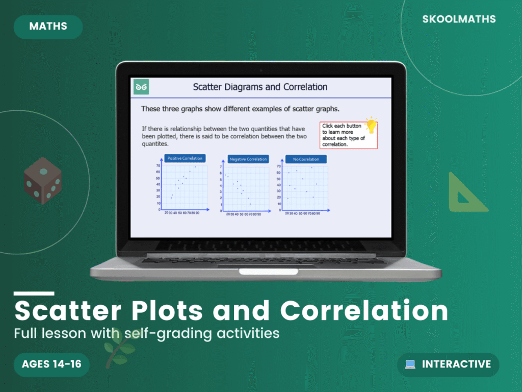
Do taller students really have bigger feet? This 32-slide interactive lesson uses scatter diagrams to show how two sets of data can be connected.
Students learn to use and interpret scatter graphs of bivariate data, recognise positive, negative and no correlation, and draw estimated lines of best fit. Worked examples use height and shoe size, temperature and rainfall, and temperature and ice cream sales. Students plot a diagram, describe the correlation between test scores and use a line of best fit to predict, for example, an English score from a Maths score.
A dependable addition to a GCSE statistics topic, giving students a clear method for a topic that appears regularly in exams. Confidence here supports later work on histograms and cumulative frequency.
Build confident statistics skills today — Add to Basket.
What year group is this for? Years 10–11 (ages 14–16), GCSE.
Does it cover lines of best fit? Yes — students draw them and use them to make predictions.
Is it self-marking? Yes, with instant feedback on the questions.
| Year Groups | Year 10–11 |
|---|---|
| Resource Type | 🎓 Interactive Lesson & Activities |
| Format | Digital Only |
| Curriculum | England & Wales — KS4 (Years 10–11) |
| Added | 4 March 2026 |
Membership unlocks this resource plus every lesson, worksheet and activity — all subjects, all year groups, all in one place.

Reviews
There are no reviews yet.